App Museum of Modern Art
The product:
Designed a user-friendly mobile application and website for museum ticket booking, tailored to families, students, tourists, and art enthusiasts, ensuring seamless navigation, detailed exhibition information, and easy online booking capabilities.
Project duration:
July 2024 – August 2024


Project overview
The problem:
The current process of discovering and booking museum visits is often cumbersome and fragmented, lacking a centralized platform that offers seamless navigation, comprehensive exhibition information, and easy online ticketing options tailored to diverse user needs.
The goal:
To create a unified and user-friendly platform for discovering, booking, and managing museum visits, offering comprehensive exhibition details, personalized recommendations, and seamless ticketing to enhance the cultural experience for diverse user groups including families, students, tourists, and art enthusiasts.
My role:
As the lead designer and project manager, I conducted market research, defined user personas, created user flows, and designed the UI/UX.
Responsibilities:
Conducted market research, defined user personas, created user flows, designed the UI/UX, managed project timelines, and ensured the platform met user needs for seamless navigation and efficient booking.
User research: summary
For our museum ticket booking platform, we used both qualitative and quantitative methods. Online surveys for families, students, and tourists provided broad insights. In-depth interviews and focus groups explored specific experiences and expectations.
We initially assumed users faced booking complexity and unreliable exhibition information. Research confirmed these issues and revealed the importance of personalized recommendations, student discounts, and multi-language support, helping us refine our platform to meet diverse user needs.

User research: pain points
Complex Booking Processes
Our design will prioritize a streamlined booking flow to ensure users can book tickets quickly and efficiently.
Lack of Reliable Information
The platform will feature accurate, updated information about exhibitions and events to help users make informed decisions.
Limited Access to Discounts
We will integrate clear information about available discounts, highlighting offers prominently to ensure easy access for users.
Language Barriers
The platform will support multiple languages, making it easier for non-native speakers to access information and book tickets.
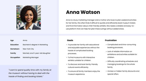
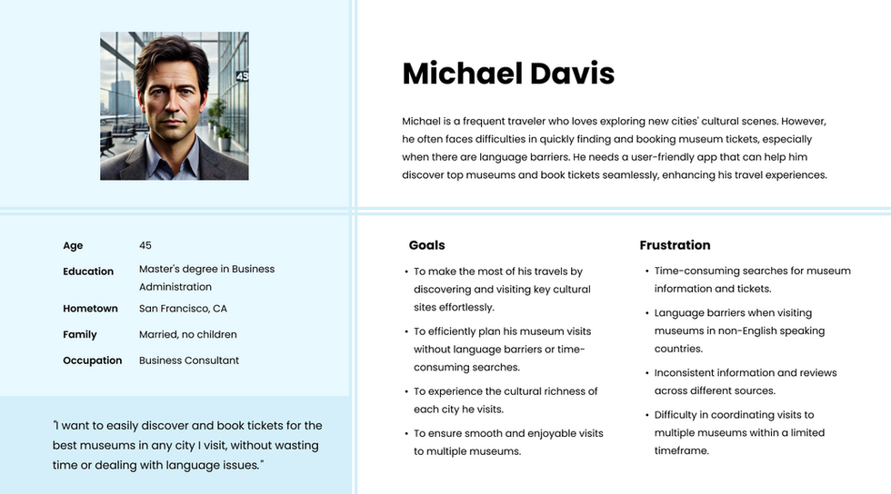
Personas
User journey map
Paper wireframes


Usability study: findings
Findings from the first study helped guide the designs from wireframes to mockups.
The second study used a high-fidelity prototype and revealed what aspects of the mockups needed refining.
Round 1 findings
The feature displaying detailed information about exhibitions was straightforward and well-accepted by users.
Some users had problems navigating through the app as they couldn't find specific sections easily.
Round 2 findings
Users expressed the need for more options to personalize their experience, such as saving favorite exhibitions and setting reminders for upcoming events.
These findings will be instrumental in refining the app to ensure a more intuitive and user-friendly experience.


Mockups
Users frequently interact with the home page, so prominent call-to-action buttons were added for direct ticket purchasing, enhancing the user experience and improving readability.
Notifications were added to keep users informed about upcoming exhibitions, events, and special offers, enhancing their overall experience.
Accessibility considerations
Used high color contrast between text and background to improve readability for users with visual impairments.
Designed forms with clear labels and instructions, ensuring they are easily navigable and assistive technology-friendly.
Regularly updated designs based on feedback from users with disabilities to enhance accessibility continuously.
Takeaways
Impact:
The design improvements for the museum ticket booking app have been well-received, with users noting an enhanced overall experience. One user commented, "The app’s intuitive interface and useful features make it essential for frequent museum visitors."
What I learned:
I learned the value of user research in identifying customer needs and iterating designs based on feedback to create a functional and user-friendly app.
Next steps
Conduct additional usability testing to refine features based on user interactions, ensuring enhanced satisfaction.
Implement and test multilingual support to cater to a broader audience.
Integrate loyalty programs and personalized recommendations to boost user engagement and retention.


